Charts
After setting up some parameters and ingesting data, Charts will most likely be your first tool to create new visualizations.
Charts allow you to view your data historically over any given time period.
To help keep charts organized, you can set them up within different groups and sections.
Groups
Groups are the highest of the folder tree within Charts. They allow you organize sections into common groups. For example, it may be beneficial to create a Group for every machine you are logging with INDAQ.
If you haven't already created a group in INDAQ, you can navigate to the Charts page to get started.
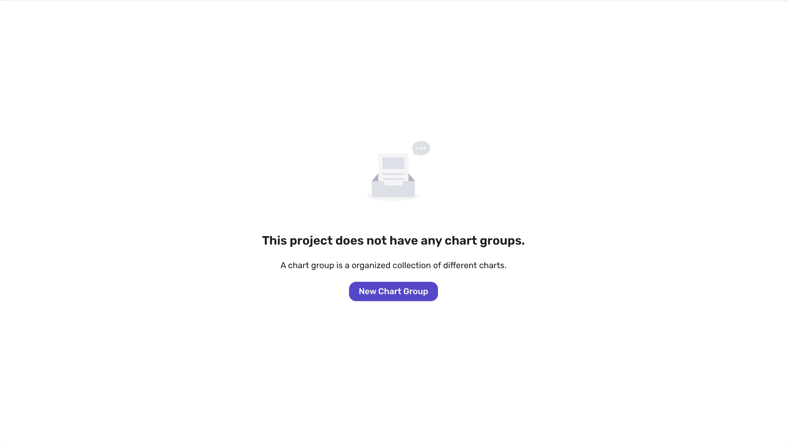
To create additional groups you can select "+ New Chart Group" in the Charts sidebar.
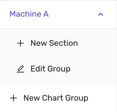
You don't have to worry about the getting the name just right as you can also edit the group name later as need in the image above.
Sections
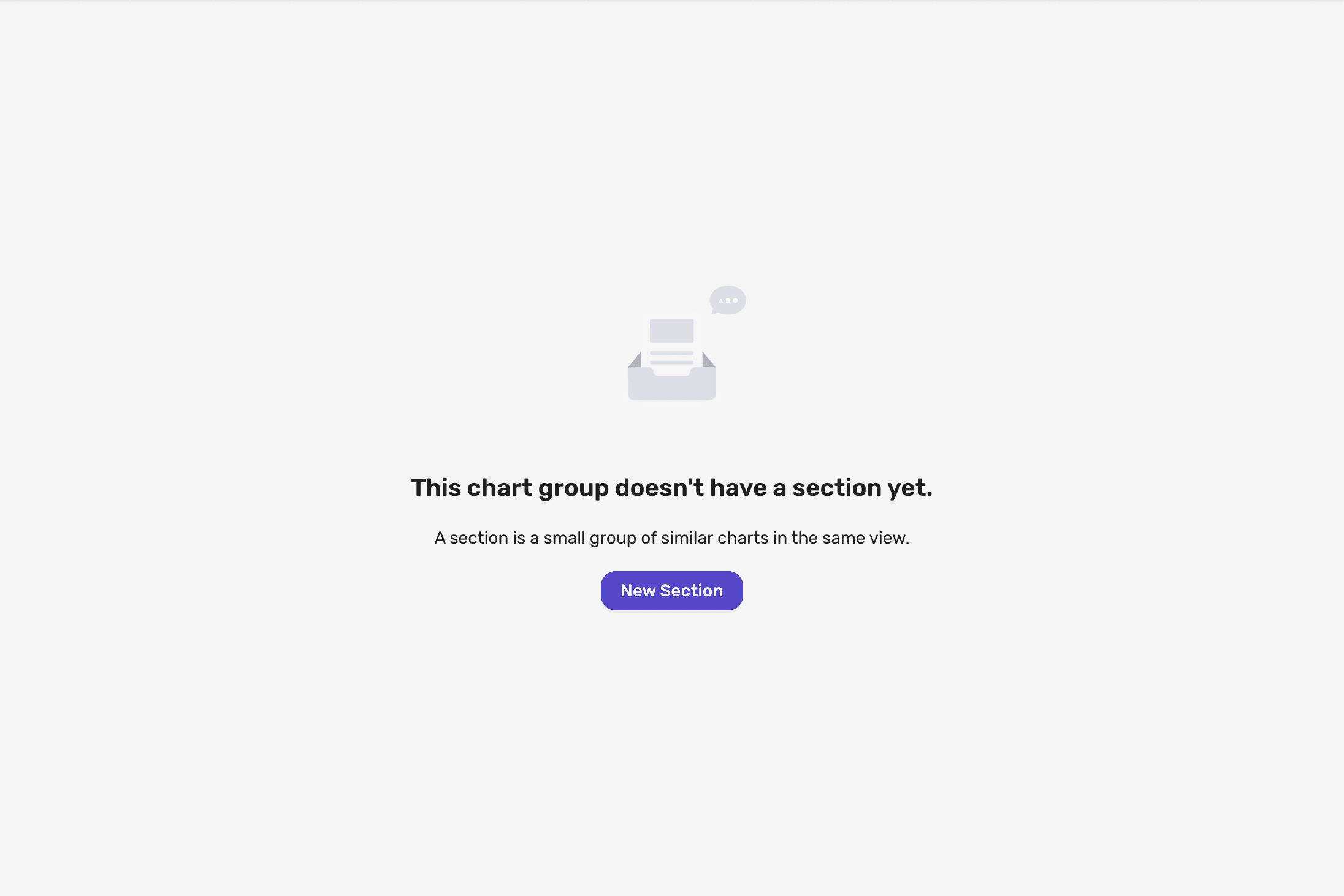
Once you have created a Chart Group, you can then split your visualizations into more Sections. For example, you can split a group into different sections for each step of the machine, or for different types of outputs like temperature or speed.
After you select a Group, if you haven't created a Section, you will be prompted to do so.
If you have already created a Section, you can always create more in the Sidebar under your active Group.
Charts
After you have created a Section you can now start created charts. When prompted give your new chart a name.
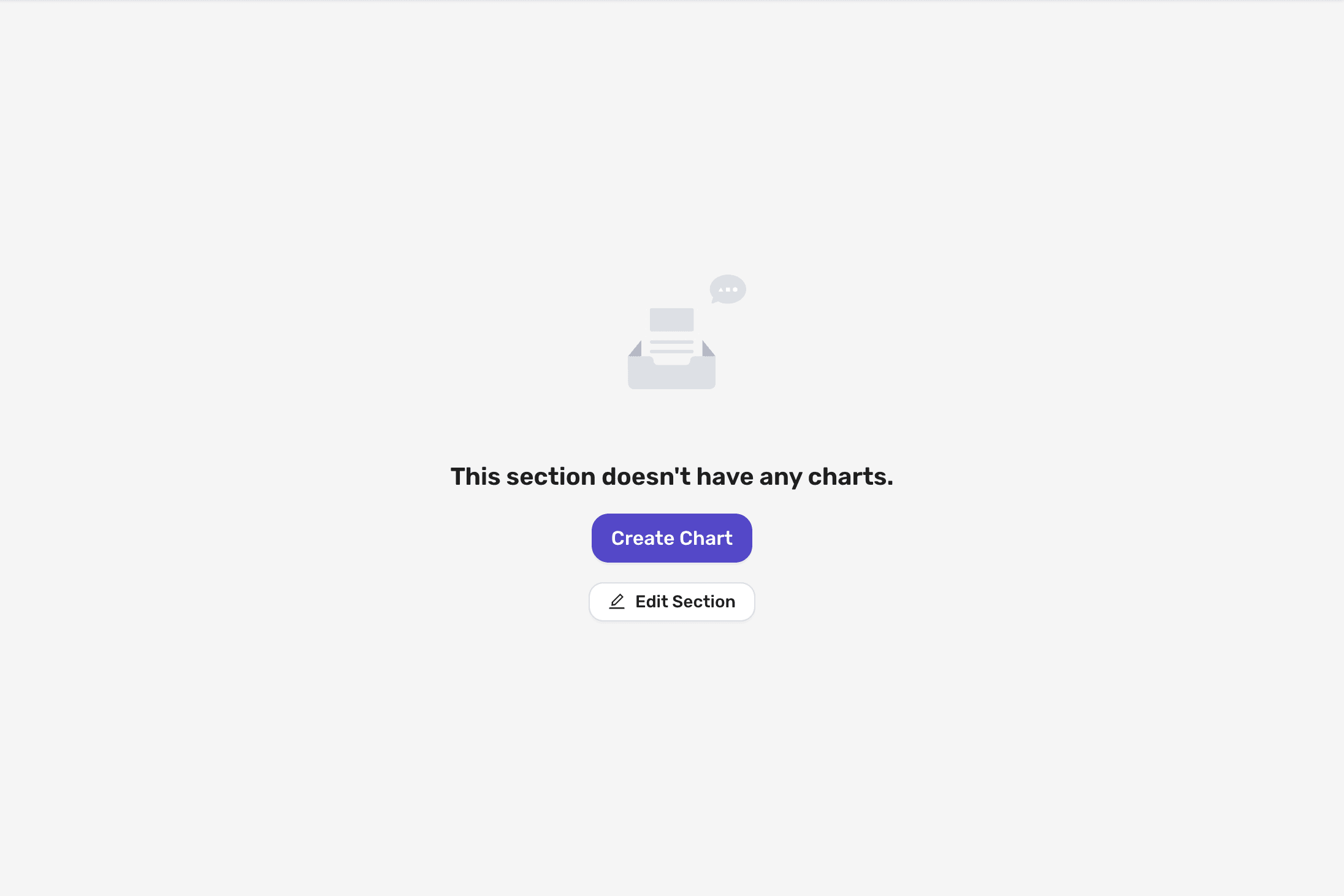
Chart Options
Now that we have a chart we can start specifing what data the chart will display.
Axes Options
Within a chart you can use both the left and right axes to display different parameters. Here you can customize the name of the axes on the charts, as well as override the default min/max value on the chart for that axis.
By default the chart minimium will try to stay around 0 and the maximum will dynamically adjust to fit the data displayed.
All Parameters
Within the All Parameters table, you can search for parameters you wish to add to the chart. You can use the tags dropdown, to filter the list of parameters shown. When selecting multiple tags, you can use the mode toggle to switch between or, where any of the tags have to present, or and where all of the tags have to be present. You can also use the search input, to filter by the Parameter name.
Selecting a row will add that parameter to the charts.
Enabled Parameters
Once you have added a parameter to the chart, you can further customize how that parameter is stepped. You can use the position dropdown to change which side the parameter is aligned to, as configured in the axes options. Marking a parameter as stepped will disable the default smoothing of the line in the chart.
Chart Viewing
Once you have configured your charts, its time to now use them to display some data.
At the top of Chart Sections is the viewing options.
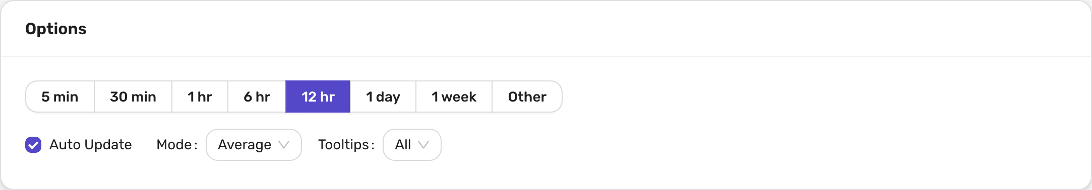
Time Range
INDAQ provides a couple of shortcuts for viewing data within a preset duration, you can specify an exact start and end time.
- 5 minutes
- 30 minutes
- 1 hour
- 6 hours
- 12 hours
- 1 day
- 1 week
Auto Update
By default, INDAQ will auto update the data displayed within the charts with any new ingested data. This can be toggle on or off using the Auto Update checkbox.
Explictly selecting a start and end time will also toggle auto update off.
Mode
In order to provide a fast and relible service, INDAQ does not send the entire data set when viewing Charts. Instead INDAQ will downsample the data using the selected mode.
| Mode | Behavior |
|---|---|
| None | This mode is based off the LTTB algorithm and will try to smoothe out any outliers in the data. |
| Average | This mode will average all of the values with each bucket |
| Peak | This mode will select the highest value in each bucket |
| Valley | This mode will select the smallest value in each bucket |
Tooltips
With this option you can configure the tooltip that is display when you hover over the chart.
| Tooltip | Behavior |
|---|---|
| Single | Only show the parameter value that is currently being hovered over |
| All | Show all parameters for the time that is currently being hovered over |
| None | Disabled all tooltips |