Dashboards (Beta)
Beta dashboards let you combine different kinds of widgets on one page, so you can see a parameter's current value right next to its recent history. Each widget is a number, a line chart, an area chart or a bar chart, and you can size and arrange them however you like.
Beta dashboards are the first page you see when you open a project, and can be found under Dashboard (Beta) in the INDAQ sidebar.
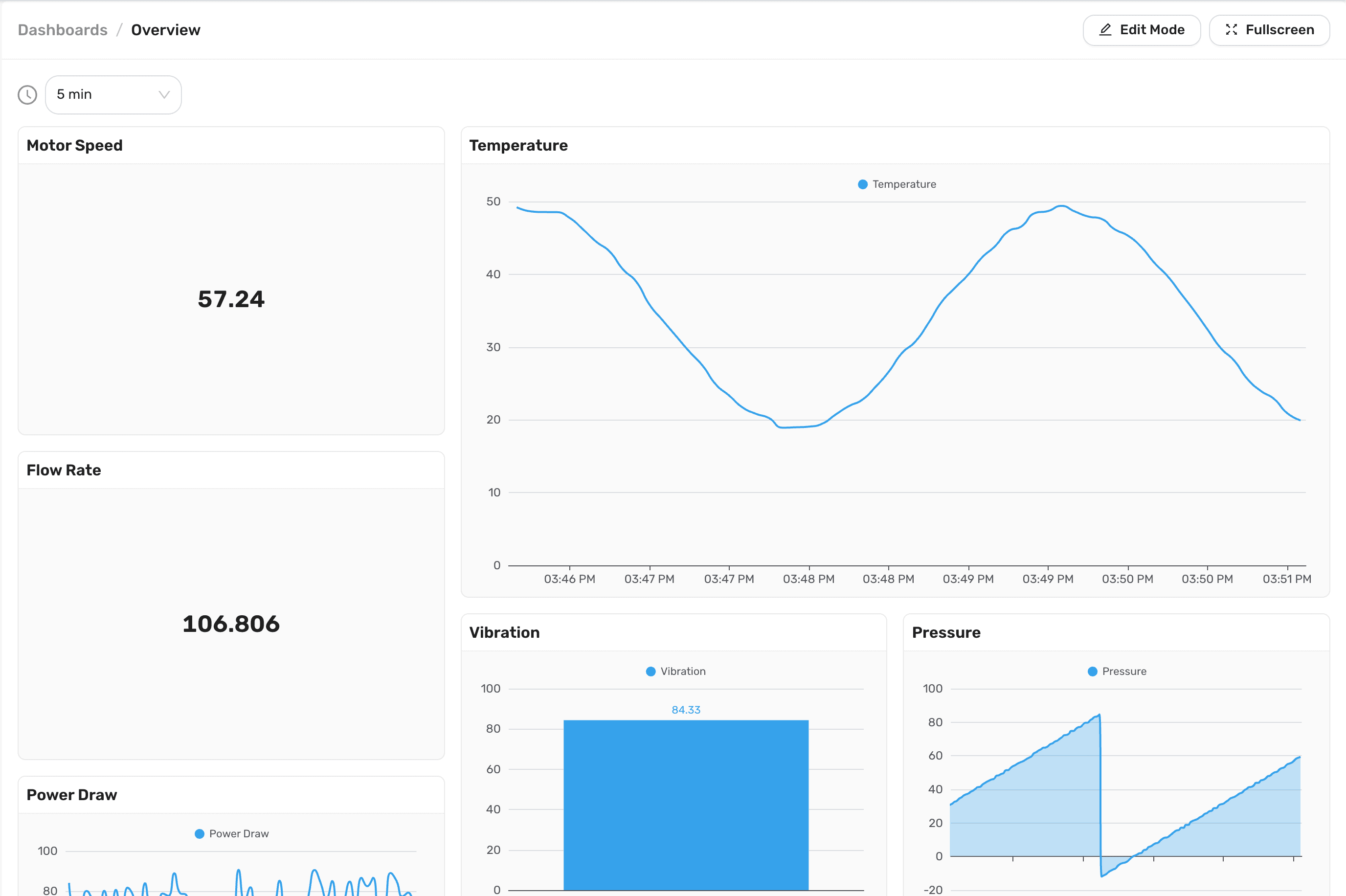
Beta dashboards are still being improved, and may change as we hear from you. Your existing Charts, Bar Graphs and Dashboards can be copied into a beta dashboard at any time. See Converting other pages.
Creating a dashboard
The Dashboard (Beta) page lists the project's beta dashboards, along with how many widgets each one has and when it was last updated. Select a dashboard to open it, or use the search box to find one by its name or the name of one of its widgets.
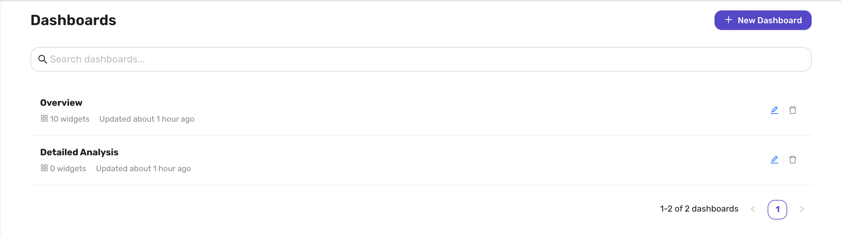
To create a dashboard:
- Select New Dashboard.
- Enter a name for the dashboard in the box at the top of the page.
- Add some widgets.
- Select Create.
The new dashboard isn't saved until you select Create. Dashboard names must be between 3 and 255 characters long, and may contain letters, numbers, spaces and the symbols - _ ( ) % # @ ! $ ^ & * : ; . , /.
To delete a dashboard, select the trash icon on its row in the list, then Delete.
Editing a dashboard
Dashboards open in view mode. To make changes, select Edit Mode at the top right of the dashboard. In edit mode you can rename the dashboard in the box at the top of the page, and add, change, move, resize, copy and delete its widgets.
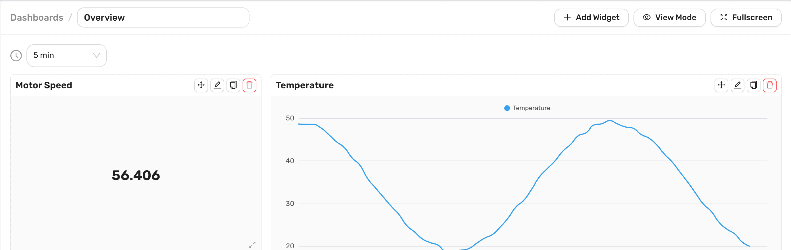
Your changes are not saved until you select Save, and (unsaved changes) is shown next to the dashboard's name until you do. Select Discard to undo everything since the last save. When you are done, select View Mode. If you still have unsaved changes, you will be asked whether to save or discard them.
Unsaved changes only exist in your browser tab. Closing or reloading the tab discards them without asking, so remember to select Save.
Adding widgets
- In edit mode, select Add Widget.
- Choose a Widget Type and enter a Widget Name. The name is shown at the top of the widget.
- Fill in the widget's settings, described for each type below. A preview on the right shows how the widget will look.
- Select Add Widget, then Save the dashboard.
To change a widget later, select its Edit button in edit mode.
Arranging widgets
The dashboard is a grid six columns wide, and each widget can be up to six columns wide and six rows tall. New widgets are placed in the first free space on the grid.
In edit mode, each widget has these buttons along its top edge:
| Button | Description |
|---|---|
| Move | Drag this button to move the widget. Any widgets in the way are moved aside. |
| Edit | Change the widget's settings. |
| Copy | Add a copy of the widget to the dashboard, with "(Copy)" added to its name. |
| Delete | Remove the widget from the dashboard. |
To resize a widget, drag the handle in its bottom right corner.
Widgets
There are five types of widget:
| Widget Type | Shows |
|---|---|
| Number | The value of a single parameter, optionally colored by thresholds or states. |
| Line Chart | How one or more parameters have changed over the time range, as lines. |
| Area Chart | How one or more parameters have changed over the time range, as shaded areas. |
| Time-series Bar Chart | How one or more parameters have changed over the time range, as bars that each summarize a slice of time. |
| Bar Chart | The latest values of several parameters side by side, like a bar graph. |
Number
A Number widget shows a single value from one parameter, in large text that is easy to read from across a room.
| Setting | Description |
|---|---|
| Parameter | The parameter to show. |
| Display Type | Current Value shows the most recent value INDAQ has received. Average, Minimum and Maximum show the average, lowest or highest value during the dashboard's time range. |
| Unit | The unit of the value, such as °C, PSI or kW. |
| Thresholds | Labels and colors for the widget to use for different values. Select Add to add one. |
| Mode | How the thresholds are matched to the value. See below. |
Each threshold has a value, a label, and a color of Red, Yellow, Green, Blue, Grey or Black. Mode decides how they are used:
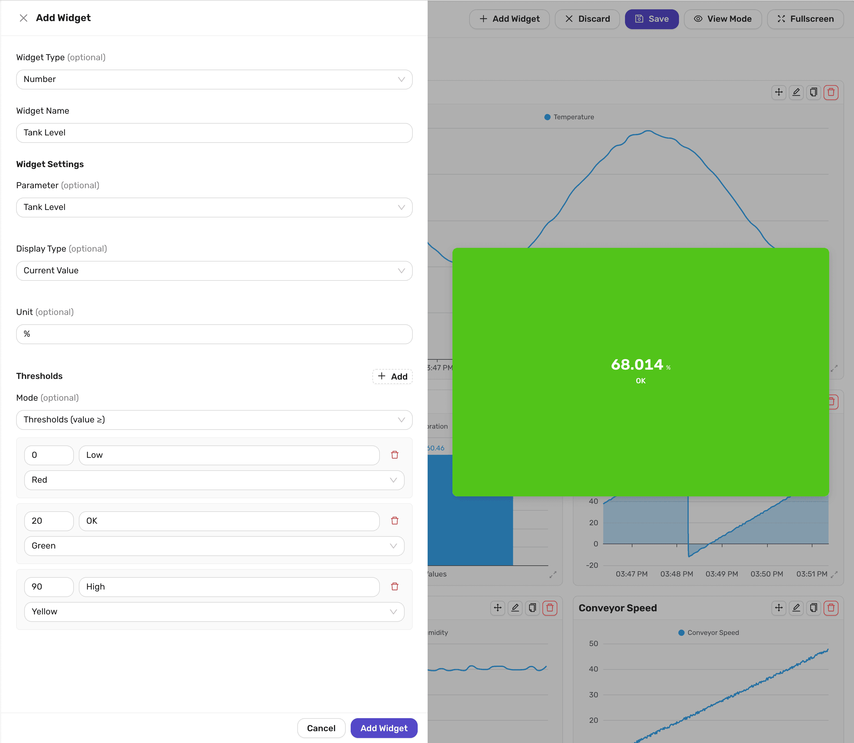
- Thresholds (value ≥) uses the threshold with the highest value that the parameter's value is greater than or equal to. The widget is filled with that threshold's color, and its label is shown under the value. For example, a tank level widget with thresholds of
0labelledLowin red,20labelledOKin green and90labelledHighin yellow shows a level of68in green, with the labelOK. Values below the lowest threshold are not colored. - States (exact match) is for parameters that report a state as a number, such as
1for running and0for stopped. When the value is exactly equal to one of the threshold values, the widget shows that threshold's label in place of the value, filled with its color. The value itself is hidden unless you uncheck Hide current value. Values that don't match any of the thresholds are shown as numbers.
Values are shown with up to three decimal places. A widget shows -- until its parameter has a value to show.
Line Chart
A Line Chart shows how one or more parameters have changed over the dashboard's time range.
| Setting | Description |
|---|---|
| Parameters | The parameters to plot. Select Add to add one. For each parameter, choose whether it is measured against the Left Axis or the Right Axis, and turn on Stepped to draw it as a series of steps rather than a smooth line. |
| Sampling Mode | How the data is reduced when the time range holds more readings than the chart can show. See below. |
| Axis Configuration | Optional Min and Max values for the Left Axis and Right Axis. When they are left empty, each axis always includes 0 and extends to fit the data displayed. |
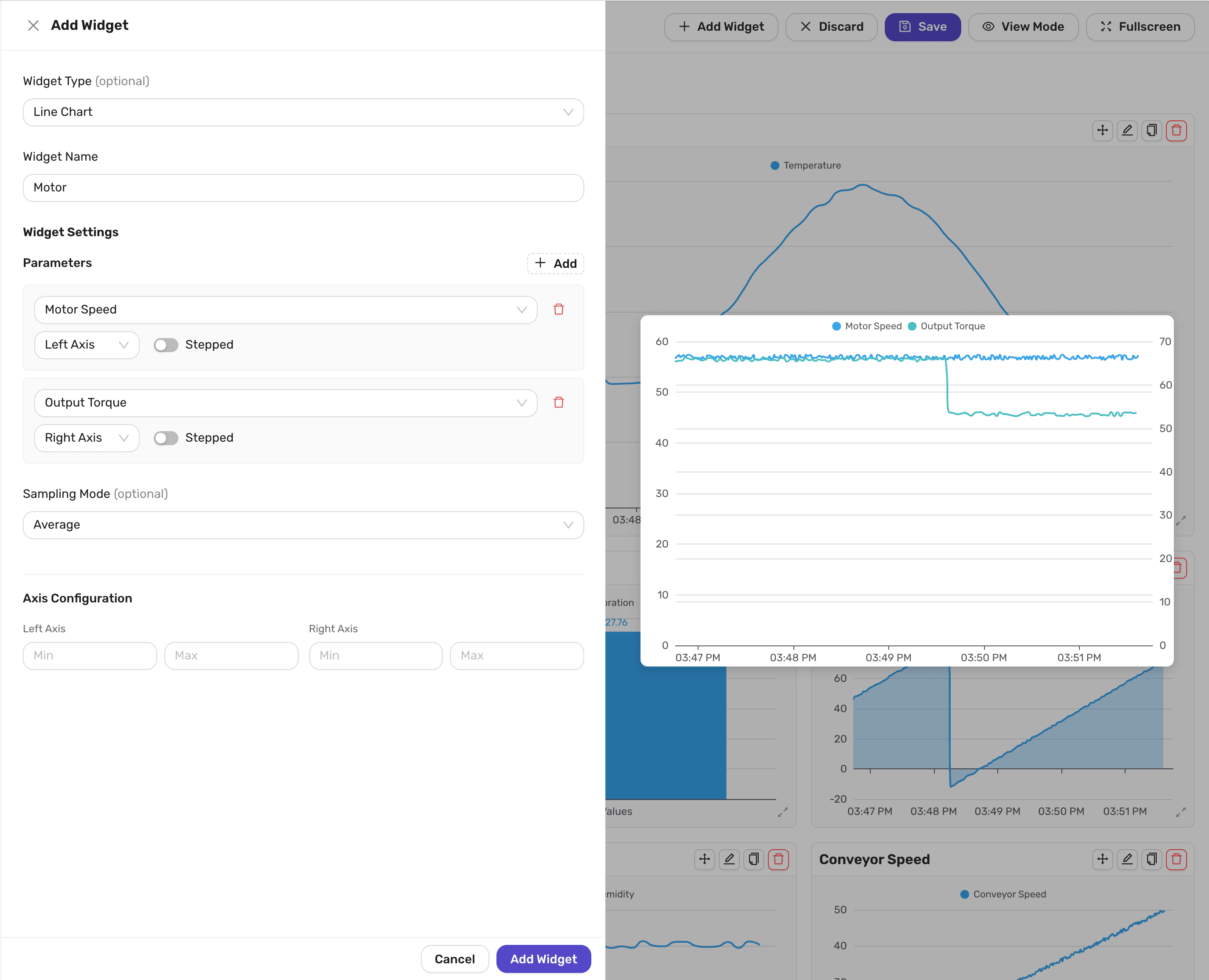
To keep dashboards fast over long time ranges, INDAQ does not send every reading to the chart. Instead it divides the time range into small slices and sends one value for each, chosen using the Sampling Mode:
| Sampling Mode | Behavior |
|---|---|
| Average | The average of the readings in each slice. This is the default. |
| Minimum | The lowest reading in each slice. |
| Maximum | The highest reading in each slice. Useful for making sure that short spikes are not missed. |
| Optimized | The readings that best preserve the overall shape of the line, based on the LTTB algorithm. |
When the time range holds only a few hundred readings, every reading is shown and the Sampling Mode makes no difference.
Using two axes lets you plot parameters with very different ranges on the same chart, such as a temperature in the hundreds alongside a pressure below ten.
Area Chart
An Area Chart is a Line Chart with the area under each line shaded in. It has all of the same settings, plus:
| Setting | Description |
|---|---|
| Stacking Mode | Overlapping draws each parameter's area from zero, so they overlap. Stacked draws each area on top of the one before it, so the top of the chart shows the total. |
| Fill Opacity | How strongly the areas are shaded, from 0 for no shading to 1 for solid. The default is 0.3. |
Time-series Bar Chart
A Time-series Bar Chart shows how one or more parameters have changed over the time range as bars. The time range is split into equal intervals, and each bar summarizes one parameter during one interval, using the Sampling Mode to choose the average, lowest or highest value. The number of intervals depends on the width of the widget.
It has the same Parameters, Sampling Mode and Axis Configuration settings as a Line Chart, except that there is no Stepped option, plus:
| Setting | Description |
|---|---|
| Bar Mode | Grouped draws the parameters' bars next to each other. Stacked draws them on top of one another, so the height of each stack shows the total. |
Bar Chart
A Bar Chart compares the latest values of several parameters side by side, in the same way as a bar graph. Unlike the other charts, it shows the current values rather than the time range.
| Setting | Description |
|---|---|
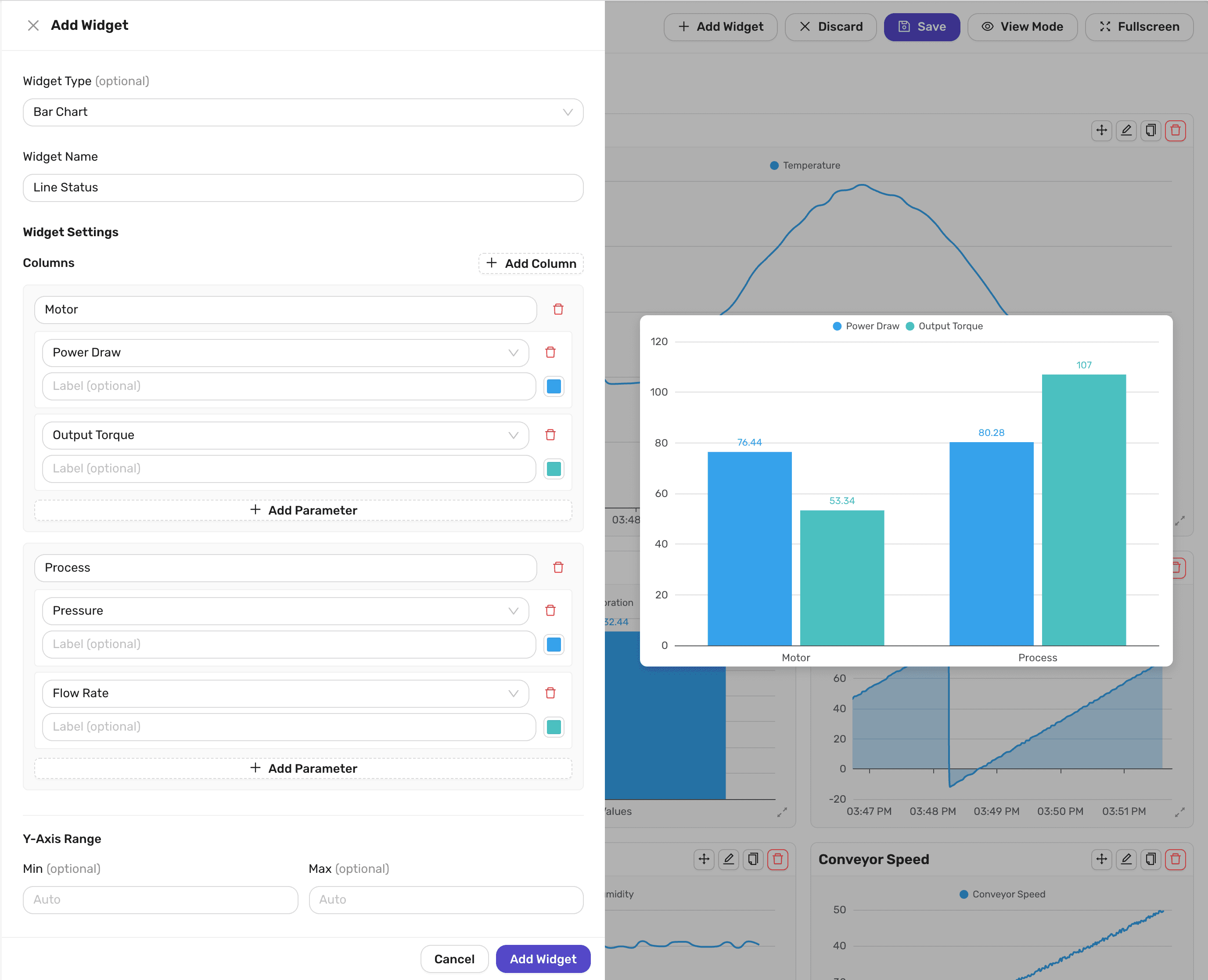
| Columns | The clusters of bars along the bottom of the chart. Select Add Column to add one, and give it a name such as Zone 1. Within each column, select Add Parameter for each bar you want. Each bar can have an optional Label, which replaces the parameter's name, and a color. |
| Y-Axis Range | Optional Min and Max values for the chart's axis. When they are left empty, the axis always includes 0 and extends to fit the values displayed. |
Bars are grouped across columns by their position. The first parameter in every column makes up one series, which has a single entry in the legend, and the second parameter in every column makes up another, and so on. Each series takes its name and color from the first column. For the clearest chart, put the same kind of parameter in the same position in each column. For example, put each zone's set-point first and its feedback second.
Viewing a dashboard
Everything in this section works in view mode, and is available to everyone in your organization.
Time range
The time range is chosen in the dropdown above the widgets. It applies to every widget on the dashboard.
| Time Range | Shows |
|---|---|
| 5 min, 30 min, 1 hr, 6 hr, 12 hr, 1 day or 1 week | The most recent part of your data. |
| Custom range | A start and end time of your choosing. The dashboard does not update, and Number widgets showing the Current Value, as well as Bar Charts, show the values as they were at the end of the range. |
With one of the preset ranges, Number widgets showing the Current Value and Bar Charts update every 5 seconds. Line Charts, Area Charts, Time-series Bar Charts, and Number widgets showing an Average, Minimum or Maximum don't move forward while the dashboard stays open: they keep showing the range as it was when you opened the dashboard. Reload the page to bring them up to date.
The default is 5 min. INDAQ remembers your choice in your browser, and uses it for every beta dashboard you open.
Reading charts
Hover over a chart to see the time and the value of each of its parameters at that point. The other charts on the dashboard show the same moment, which makes it easy to compare them.
Select a parameter in a chart's legend to hide or show it.
Expanding a chart
In view mode, hover over a chart and select the Fullscreen button in its top right corner to expand it over the dashboard. Select Exit Fullscreen, or press Esc, to return.
An expanded chart has buttons below it to move backwards and forwards in time, and to zoom in and out. Using them switches the dashboard to a Custom range. Choose one of the other time ranges to return to the most recent data.
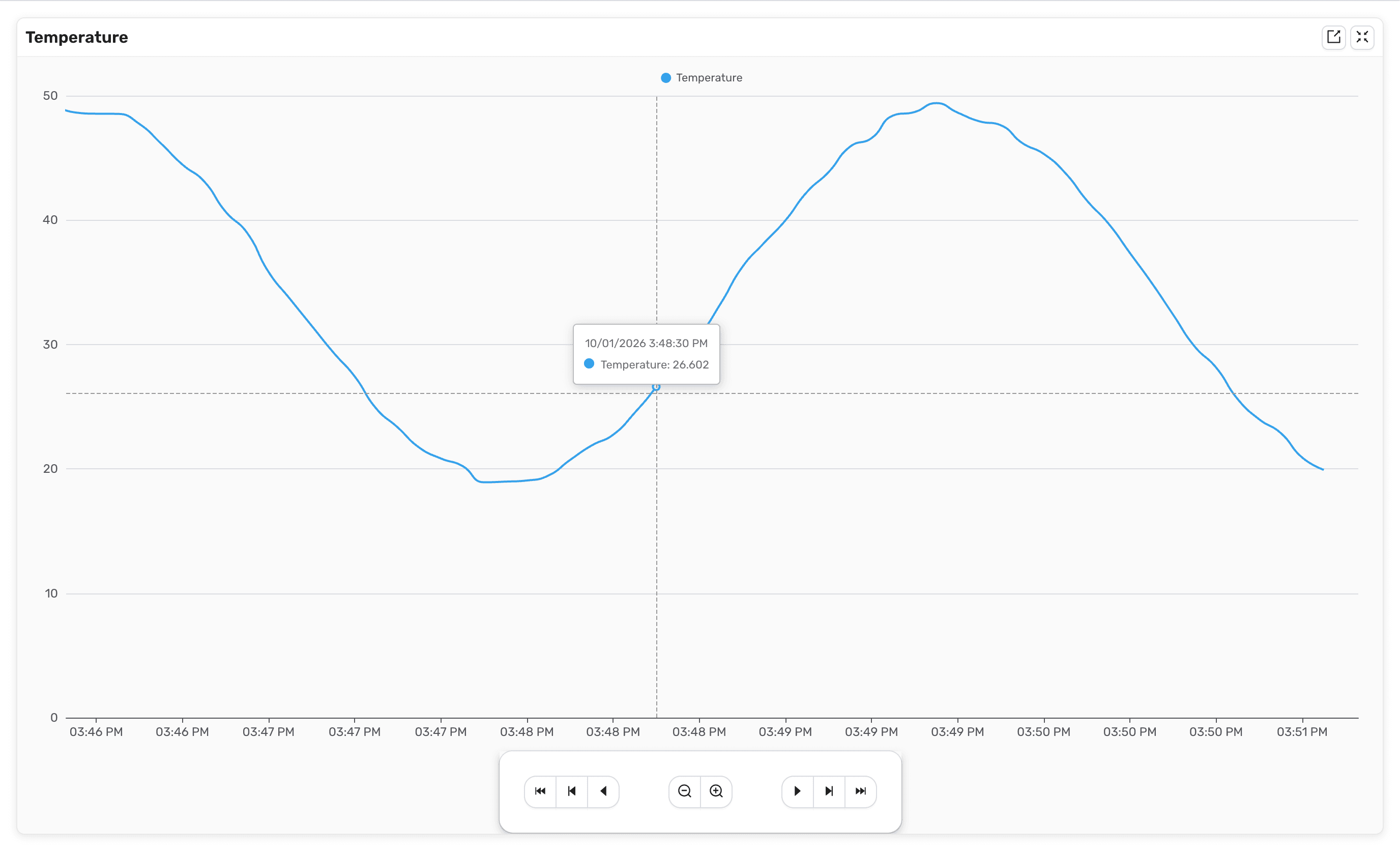
To download the data shown in an expanded Line or Area Chart, select its Export button. Choose a Data Format and an Export Format, then select Export.
Fullscreen
Select Fullscreen at the top right of the dashboard to fill your screen with it, for example on a wall-mounted display. Select Exit Fullscreen, or press Esc, to return.
Converting other pages
Your existing chart sections, bar graph sections and dashboards can each be copied into a new beta dashboard:
- Open the chart section, bar graph section or dashboard, and select Convert to Widgets at the bottom of the page.
- Enter a Dashboard Name, then select Convert.
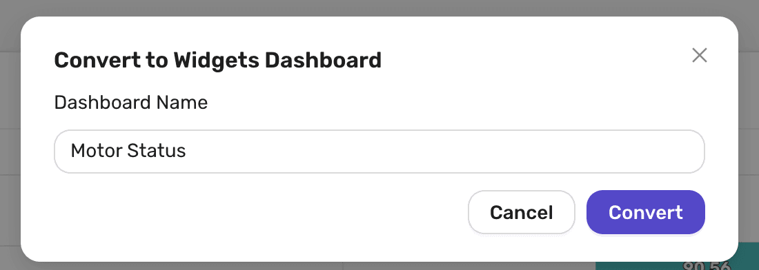
INDAQ creates the new dashboard and opens it.
| Converting | Creates |
|---|---|
| A chart section | A Line Chart for each chart, with the same parameters, axes and stepped settings. |
| A bar graph section | A Bar Chart for each graph, with the same columns, parameters and labels. |
| A dashboard | A Number widget for each tile. State tiles keep their states. Displayed units are not copied. |
Converting makes a copy. The original page is left unchanged, and later changes to one are not copied to the other.
Permissions
Organization Owners and Managers can create, change and delete beta dashboards, and convert other pages into them. Everyone else in the organization can view them, including changing the time range, expanding charts and exporting data. See Member Roles for more about roles.